
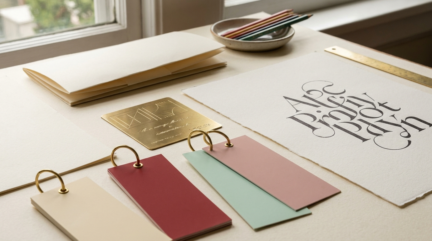
Before a customer reads a single word on your beauty brand's site, your typeface has already spoken. It whispers luxe or shouts fun; it feels clinical and clean or warm and handmade. For a cosmetics brand in the Netherlands competing on shelves and in Instagram feeds, type is not decoration — it is one of the fastest ways to signal who you are and what you cost. The good news for beginners: you do not need fifty fonts. You need two chosen with intent, and a few simple rules to make them work.
What each type style is really saying
Every typeface carries associations, and knowing them is half the job. Serifs — the ones with little feet — read as classic, trustworthy and premium, which is why heritage skincare and fragrance houses lean on them. Sans-serifs feel modern, clean and efficient, the default for clinical, science-led beauty. Scripts and handwritten faces feel personal and artisanal, perfect for a small-batch or natural brand, but they tire the eye in long text. Display faces are the show-offs: full of character, built for a logo or a headline, never for a paragraph. Match the feeling of the face to the feeling you want the customer to have.
- Pick one display or heading font for personality, and one text font chosen purely for legibility.
- Pair for contrast, not similarity: a serif heading with a sans body reads more clearly than two lookalikes.
- Limit yourself to two families (three at most); use weight and size for variety, not new fonts.
- Check legibility on a real phone at arm's length — if the body copy strains, the font is wrong.
- Mind the details: generous line spacing, sensible line length, and enough contrast against your background.
- Confirm licensing and web-font performance before you fall in love — a slow or unlicensed font is a liability.
Work with us
Want help choosing and pairing typefaces for your beauty brand? Talk to FOCUS POINT.
Get your type systemA simple pairing recipe for beauty brands
DATA
Type is a conversion lever, not just a mood. Reading is effort, and every extra bit of friction costs you: studies of on-screen reading consistently show that poor legibility slows comprehension and raises bounce. On mobile, keep body text at least 16px, aim for 45-75 characters per line, and never sacrifice contrast for a paler, prettier grey. A gorgeous headline means nothing if the ingredient list is a struggle to read.
Start simple: choose one characterful heading face that captures your brand's personality, pair it with a clean, workhorse text face, and apply them consistently everywhere — packaging, site, ads and email. That consistency is what turns a font into a recognizable asset. If you would like help choosing and pairing typefaces that fit your beauty brand and perform across every touchpoint, our visual-identity team can guide you from first font to full system.
Ready to put this to work?
Let's start a project together.
Tell us about your brand. We come back with a strategic read within 48h.